There are four key facts you need to know about the Interboro Express, aka the IBX, aka the proposed new transit line for NYC:
- The IBX would run from Bay Ridge in Brooklyn to Jackson Heights in Queens.
- The path of the IBX is based on the path of two active freight rail lines, the Bay Ridge Branch and the Fremont Secondary.
- Details on the IBX are currently sparse because the MTA’s plans for it are still in the early stages.
- Even the IBX’s modality is yet to be determined. It may ultimately be conventional rail, light rail, or bus rapid transit.
Since the one thing about the IBX which is certain is its general path, here’s a quick mockup showing how it would integrate with New York’s subway system:
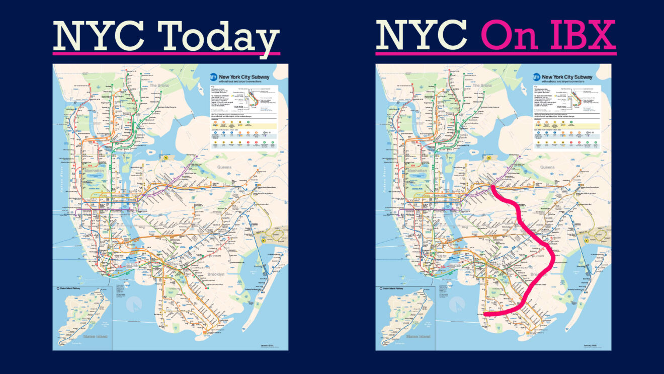
The pink line representing the path of the IBX intersects with 17 of the city’s 22 subway lines — nearly all of which were built to bring people in and out of Manhattan, not to help them travel to and through the other four boroughs. The IBX would connect Brooklyn and Queens to the east of the G, cross the subway-less Flatlands, and close the gap in train service through Middle Village.
Do you find this proposed new transit line intriguing? Do you want to learn more?
If so, then you came to the right place! I studied the IBX for my grad school thesis project, so I have a few things to say and share about it. (My thesis was framed as a work of advocacy, was titled “BUILD THE IBX,” and used some leading language throughout the project.) Continue reading straight down or use the navigation menus to skip ahead if you’re more interested in another section of this soon-to-be two-part piece.
Choose Your Next Stop:
Mapping The IBX: Where Are The IBX-lands? | Demographics Of The IBX-lands | Sources
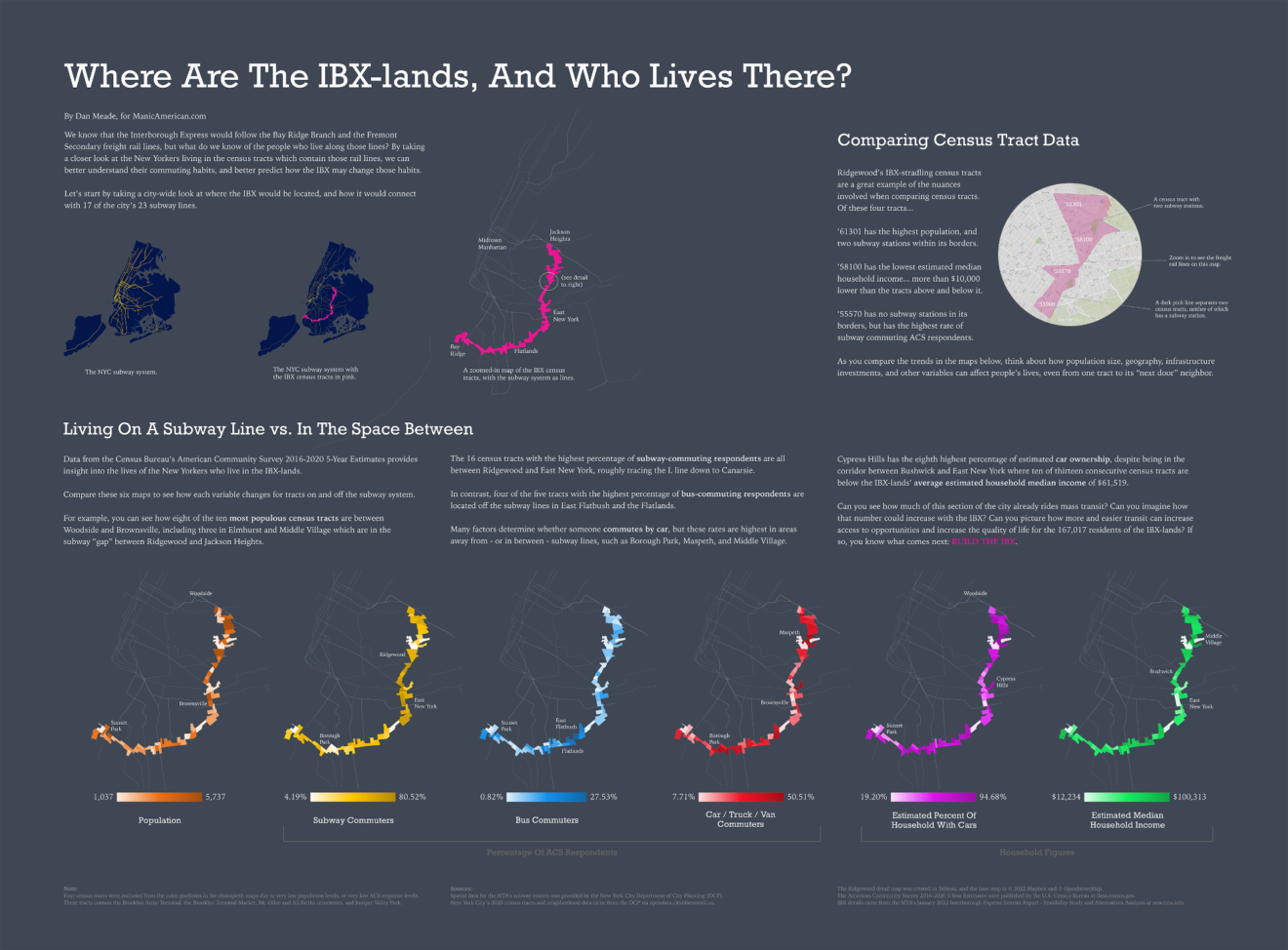
Where Are The IBX-lands, And Who Lives There?
Did you find that first “squiggly line over the MTA’s subway map” graphic a little… underwhelming? So did I. Right now, far too many maps of the IBX look like that because so much about the IBX remains uncertain.
That’s why I set out to build a better map of the IBX. Inspired by the work of James Cheshire and Oliver Uberti in their book Atlas of the Invisible, I chose to forgo simply mapping the plan for the IBX. Instead, I wanted to map the need for the IBX.
I approached that idea by focusing on the 58 census tracts which contain the freight lines that are the basis for the path of the IBX. Why? Because those census tracts are full of people.
Those census tracts are also full of data, so once I created my in-group of IBX census tracts, I had a rather effective way to analyze data about the people who live within walking distance of the IBX. If I could understand the people who live in the IBX-lands, I could understand why they would need the IBX, and how the IBX could benefit them.
I summarized all my census data analysis in one large data visualization graphic (which may take a moment to load). If you’d like to download the graphic so that you can zoom in and explore all the details at your leisure, click here. If you’re reading this on mobile, don’t worry: the key maps are enlarged in the next section.
Choose Your Next Stop:
Mapping The IBX: Where Are The IBX-lands? | Demographics Of The IBX-lands | Sources
The Demographics Of The IBX-lands
I focused my analysis on two areas: data from the Census Bureau’s American Community Survey 2016-2020 5-Year Estimates that relate to how people commute, and how that data changed depending on whether or not people live in a census tract which contains a subway line.
The MTA, and the RPA before them, had already covered a lot of racial, income level, and similar demographic data, so I didn’t want to repeat their work. I also wanted to do my work at a much more human scale than those organizations had done. Instead of using city-wide graphics and showing the impact of the IBX on tens of thousands of people, I wanted to focus on neighborhoods and what the IBX would mean to the individual people who would ride it.
You can read more about my methodology here, but there are two methodological notes I’ll make here:
1) Commuter data is highly reliant on where people are commuting to. A destination off a train or bus line may require a car or similar vehicle to reach it. At the same time, housing that doesn’t include a driveway or parking spot may make driving less of an option for those who live there.
2) I excluded four census tracts from the color gradients in the choropleth maps of the IBX-lands due to them having either very low population levels, or very low ACS response levels (or both). These tracts are colored fully white, and contain the Brooklyn Army Terminal, the Brooklyn Terminal Market, Mt. Olive and All Faiths cemeteries, and Juniper Valley Park.
So, after acknowledging that information like destinations and driveways were not a part of my data sets, here is a closer look at the commuting habits and needs of the people who live in the IBX-lands, each broken out into its own image. As you look at each of these expandable maps, take note of how the demographics change depending on whether or not the census tracts contain a subway line.
Population
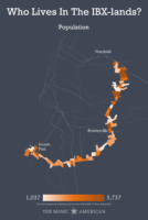
167,017 people live in the IBX-lands. That figure may seem small by New York City standards, but if the IBX-lands were their own city, they would be the fifth most populous city in New York State (after Yonkers and before Syracuse).
Eight of the ten most populous census tracts in the IBX-lands are between Woodside and Brownsville, and contain 40,448 people, or 24% of the population of the IBX-lands. Many of these tracts are along the L and M subway lines.
Notably, two of the top three most populous census tracts along the IBX route are in Elmhurst, fully located in the gap in subway service between Ridgewood and Jackson Heights.
Subway Commuters
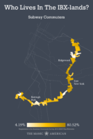
There is a pretty clear story in the data showing that ACS respondents who live along subway lines are rather likely to commute via the subways.
In the area around East New York where the A, C, J, L, and Z converge, subway ridership among ACS respondents is through the roof: 80.52% in one East Bushwick tract. 77.15% in one Brownsville tract. 76.29% in an Ocean Hill tract.
On the flipside is Borough Park, where the census tracts in between the D and F lines have ridership rates of 16.98%, 14.18%, 7.70%, and 4.19%.
When combined with the population data, this indicates that the IBX would have a healthy supply of ready-to-go transit ridership… and that’s even before factoring in potential riders who live outside these IBX-straddling census tracts and might be transferring to or from the IBX.
Bus Commuters
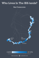
Three of the four census tracts with the highest bus ridership among ACS respondents are in the area of East Flatbush and Flatlands where there are no subway lines. The B6, which runs through this area, is one the most-used bus routes in the city.
Yet none of these tracts have higher than 30% bus ridership levels among ACS respondents.
Could the IBX increase mass transit use in areas like these, especially if it were quicker and provided more single-seat rides then someone’s current bus-to-train or bus-to-bus commute? I delve into this idea more in Part 2 (coming soon!), but I like to think that the short answer is, “yes.”
Car / Truck / Van Commuters
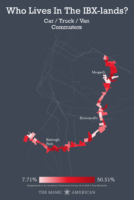
It is pretty easy to say that, after looking at the mapped data, that rates of car, truck, and/or van commuting are highest in areas away from — or in between — subway lines, such as Borough Park, Maspeth, and Middle Village.
However, the two census tracts with the highest rates of car+ commuters — and the only two tracts with rates above 50% — throw a little noise into that initial takeaway. While the Maspeth tract is fully in the “gap” in subway service in Middle Village, the Mapleton-Midwood one abuts the F train between the 18th Av and Avenue I stops.
Ten of the 15 tracts with the highest rates of car+ commuting ACS respondents are located between Borough Park and Flatlands, a stretch that offers north-south subway service, but not east-west service.
This is a broad category with many variables — including the role of dollar van networks — but compare that darker red stretch to the one directly to its left, which follows the east-west curve of the N and has much lower rates of car+ commuting. An east-west flowing IBX in this area may help get some of these drivers and riders (and their vehicles) off the road, thus creating less traffic and better commutes for all roadway commuters.
Estimated Percent of Households With Cars
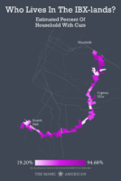
You want to talk nuance? Consider this:
One Cypress Hills tract has the eighth highest percentage of estimated car ownership in the IBX-lands (83.26%), despite being in the corridor between Bushwick and East New York where ten of thirteen consecutive census tracts are below the IBX-lands’ average estimated household median income of $61,519.
That tract is between the Broadway Junction and Van Siclen Av subway stops, abuts a cemetery, and contains the terminus of the Jackie Robinson Parkway. It’s estimated MHHI is $29,615.
More transit options won’t take every car off the road. If people need cars, they’ll continue to need cars, even if those cars may be an economic burden. But, again, even if the IBX would not bring all car owners to their destinations, it could remove some cars, trucks, and vans from the roads, thereby creating smoother and quicker commutes that may reduce gas usage and car upkeep for car commuters.
Estimated Median Household Income
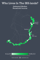
Some facts:
- Of the 58 IBX-lands census tracts, 27 of them are within $10,000 of the average MHHI for the area, which is $61,519.
- Middle Village has the only tract in the IBX-lands with a MHHI above $100,000.
- Brownsville has three of the four tracts with the lowest MHHI in the IBX-lands, including two where the MHHI is below $14,000.
- The tract that is closest to the IBX-lands’ average MHHI is in Bushwick (East). It contains the Bushwick Av-Aberdeen St subway stop. It also abuts the Cyprus Hills tract discussed above.
This is New York. Everyone is mixed together, but there are some hard lines that divide and separate us.
The IBX would bring a new level of connectivity to the city. A new train or rapid bus would make it easier for people to travel to, through, and from this area. It would — the theory goes — make it easier for people living in the IBX-lands to access more parts of the city, cheaply and quickly, thus increasing their ability to reach new potential jobs, access more services, and gain back some commuting time. They could then use that time gained back with their families, studying, sleeping, or however else they choose.
A new transit line could also open up the IBX-lands to gentrification concerns, especially the kind now happening in East New York.
If the IBX moves forward, the city and state could look to what Austin, Texas is doing as that city builds its first robust train system. Austin is dedicating anti-gentrification funds to help keep people in their neighborhoods as the land around them becomes more valuable due to the incoming train lines.
What’s Next?
Will the IBX become a reality? I don’t know. If you have an opinion or want to know more, you can provide feedback and read updates about the proposal on the MTA’s IBX website here.
Me? As much as I enjoyed parsing all these maps and data sets, I had to go beyond my computer’s desktop in order to really understand what I was looking at. I had to see the IBX-lands for myself, and actually ride the subways and buses which parallel the path of the IBX. So I spent a day traversing Brooklyn and Queens in order to better understand the area, and to get some boots-on-the-ground insight (even if only one day’s worth) into what a new transit line could mean to the people who live there.
That story unfolds in Part 2 of our IBX coverage, which is coming soon to an internet browser near you.*
Choose Your Next Stop:
Mapping The IBX: Where Are The IBX-lands? | Demographics Of The IBX-lands | Sources
Essay and graphics by Dan Meade
Published: 6/19/2022
Thesis submitted: 5/07/2022
ACS data as of: 3/17/2022
* 11/27/22 Update: Because The Manic American operates on a time scale closer to geologic than Gregorian, “coming soon” means “in development with an uncertain publication date” and not “imminent.”
More Manic Urbanism:
- Breaking Through the Tors of Perception: 700 Years of Urban Planning in Munich
- Culture Where You Least Expect It: Urban Planning Lessons from the MALL of Cookeville, TN
- Up All Night: Riding the Late Night T Service in Boston
Sources and Methodology:
The MTA’s January 2022 Interborough Express Interim Report — Feasibility Study and Alternatives Analysis provided my background information on the IBX.
The New York City Department of City Planning (DCP) provided the geospatial data of the MTA subway system, including the Staten Island Railway. The geospatial data used here is the same data used in the DCP’s NYC Capital Planning Explorer.
The DCP also provided the New York City census tracts (2020 U.S. Census) and neighborhood labels, via the “2020 Census Tracts — Tabular” data set published through the NYC Open Data portal.
I accessed the American Community Survey 2016-2020 5-Year Data from the following tables published by the U.S. Census Bureau): B01003 (Population), B08301 (Commute types), B08141 (Car ownership), and S1901 (MHHI).
To create the ACS response percentage rates, I totaled the in-group respondents for each metric and divided that figure by the total number of respondents for that metric. I based the “households with cars” figure on the sum of all households with any number of cars (one, two, or three or more).
To keep things simple, I excluded margins of error for the ACS data from these visualizations because the margins were different for each census tract.
I built the Ridgewood detail map in the primary visualization in Tableau, and its base map is © 2022 Mapbox and © OpenStreetMap.
Choose Your Next Stop:
Mapping The IBX: Where Are The IBX-lands? | Demographics Of The IBX-lands | Sources